The cryptocurrency market contains over 5000 coins and the numbers are still growing. Digital assets become brands with their very own visual identities. Let’s have a look, what’s behind the logos of Top-3 leading cryptocurrencies.
Some people say that logotypes are like faces of a particular brand. But usually, they are much more than the image. Logos convey the essence of brand identity. They help to demonstrate what makes the brand unique and what differentiates it from others.
Each and every detail of it – the symbol, the color, the shape, or the font plays an important role in creating a message and influencing the impression of the brand.
Digital currencies are not an exception. They also use visual symbols to distinguish themselves and communicate their messages. In this article, we shall have a look at Bitcoin, Ethereum and Ripple logos: what do they mean, what message they reveal and why they are as they are.
1. Bitcoin logo

What is Bitcoin?
Created by the anonymous developer Satoshi Nakamoto back in 2008, Bitcoin brought the first-ever decentralized alternative to the traditional financial system and infrastructure. It also came up with the whole new, revolutionary technology – the blockchain, a sequence of blocks that are connected and distributed among the users.
Sponsored
As Satoshi Nakamoto stated in Bitcoin’s whitepaper, the digital currency is not backed by any fiat currency. Moreover, there is no bank or government regulating Bitcoin. Bitcoins are only controlled by its users, who verify financial transactions.
Within a little more than a decade, Bitcoin became an equal method of payment, accepted in thousands of places worldwide. It has a limited total supply of 21 million, which makes BTC a scarce asset and in some way the digital equivalent of gold, which acts as a security against the inflation.
Evolution of Bitcoin logo
The world’s first and biggest decentralized cryptocurrency is well known to everyone inside the crypto industry. Even the broader audiences recognize its name and the iconic symbol. But it was not always like that.
Sponsored
When Satoshi Nakamoto first shared his discoveries of Bitcoin in 2008, its current look was far beyond what is called a logo. The view depicted a simple gold coin with two letters BC written on it in the regular faceless font.
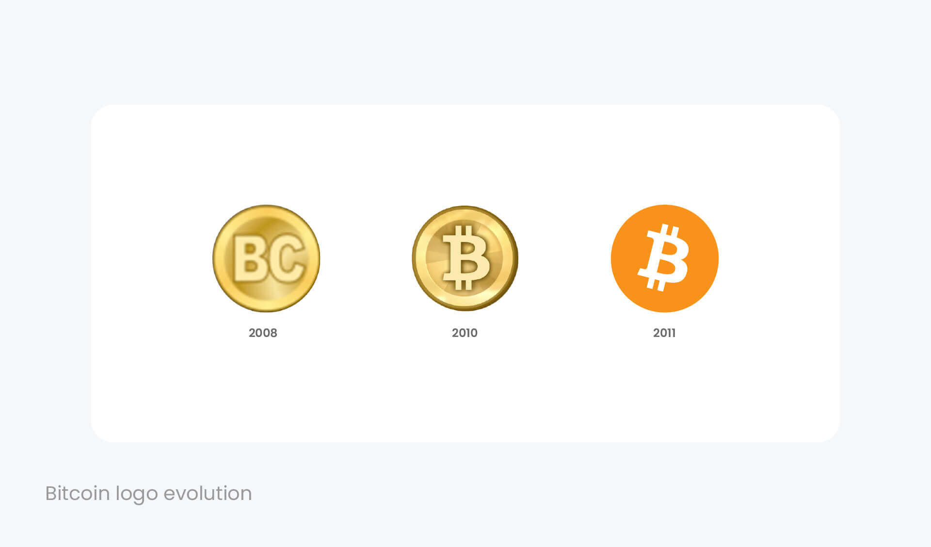
A few years later Bitcoin gained more awareness and the idea of giving a cryptocurrency a better look spread across the community. Satoshi Nakamoto updated the Bitcoin logo in 2010. He left the same golden coin as a background, removed the C letter, and put two vertical strokes to the B, referring to the famous $ sign.
Both strokes did not cross the B letter itself, nevertheless, the look of the new Bitcoin logo was criticized as too similar to Baht (฿), which is the official currency of Thailand. The crypto community split, as part of it, supported the idea, while others argued the Bitcoin logo still looks unremarkable.
The things changed, however, a few months later when the anonymous community member Bitboy offered his updates to the Bitcoin logo.
He removed the golden coin background and placed the flat orange one as the modern allusion to richness and gold. Then Bitboy also made the B letter white and titled it a little to the right side. The changes gave “the coin in a motion” feeling and created an iconic Bitcoin logo, which has not been changed up till today.
2. Ethereum Logo
What is Ethereum?
Ethereum (ETH) is the second-biggest cryptocurrency by market capitalization after Bitcoin. It is as well a programmable blockchain that allows developing and deploying numbers of other decentralized projects on its platform.
The majority of the world’s stablecoins are built on the Ethereum network, not to mention the dozens or even hundreds of Decentralized Finance (DeFi) coins of ERC-20 standard. In this case, Ethereum is the indisputable leader and the world’s most accessible blockchain network.
According to one of Ethereum developer’s Vitalik Buterin, Ethereum was created as a development platform, where other developers could start implementing their projects and do not need to build their separate blockchain networks at first. Ethereum was first of a kind and became a factor that helped the whole cryptocurrency industry evolve into what it is today.
Ethereum’s native cryptocurrency ETH is the second-biggest digital currency by market capitalization used for payments or stored as an investment.
ETH logo
The Ethereum logo is an interpretation of the octahedron, the geometric figure that has eight faces. The most common one is a regular octahedron, which classifies among five Platonic solids.
Platonic solids are the only polyhedral shapes with exactly the same faces. Each face is identical to every other face. Ancient Greeks believed that Platonic solids represent the main patterns of physical creation and also patterns behind the four elements (air, fire, earth, and water).
The octahedron is the third of these solids and represents the element of air, which is a symbol of life, inspiration, communication, and intelligence. Accordingly, the air is one of the common meanings of the word “ether”. And in terms of Ethereum, both of them act as invisible mediums.
Evolution of Ethereum logo
The first Ethereum logo was created by its founder Vitalik Buterin. It came as an interpretation of sigma (Σ), the eighteenth letter of the Greek alphabet and a mathematical symbol of summation. In a draft logo, two sigma signs were combined together and rotated by 45° to form a figure of a diamond.
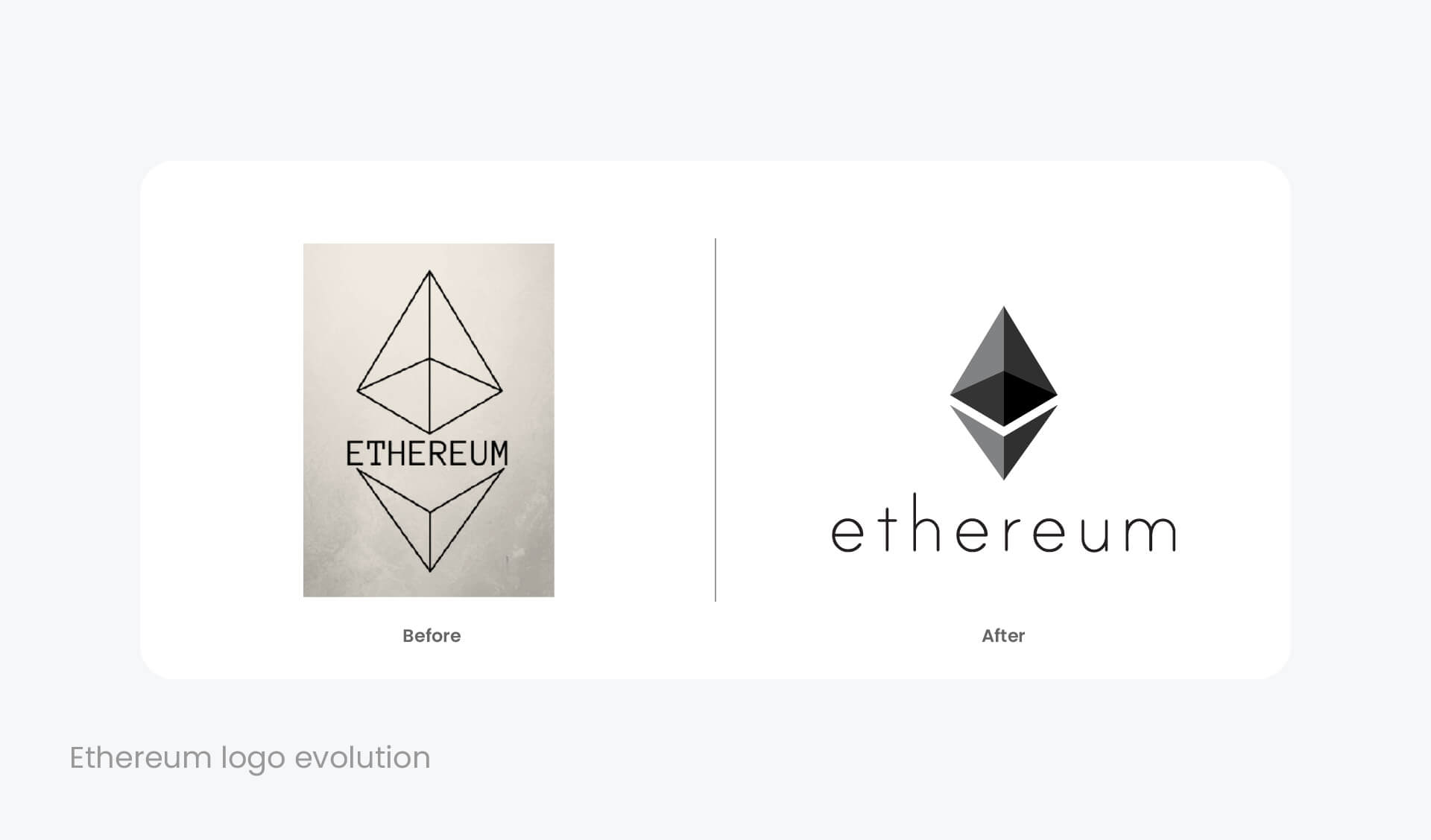
Nevertheless, the team later held the competition in for the new logo. The ideas of two separate participants were combined to form a current Ethereum logo. According to one of the winners, Gianni Dalerta, he was inspired by the original icon of two Σ coming together, where one of them is still open and represents the open-source. Meanwhile, another part is a mesh, that “can sift in or out. Sifting helps to get to the essence of a premise of Ethereum”.
The current Ethereum logo consists of the three-dimensional octahedron, however, the shape is divided into two parts, separated by the gap. The logo combines two elements, the symbol, and typography, that can appear in the same line with the symbol, or below it.
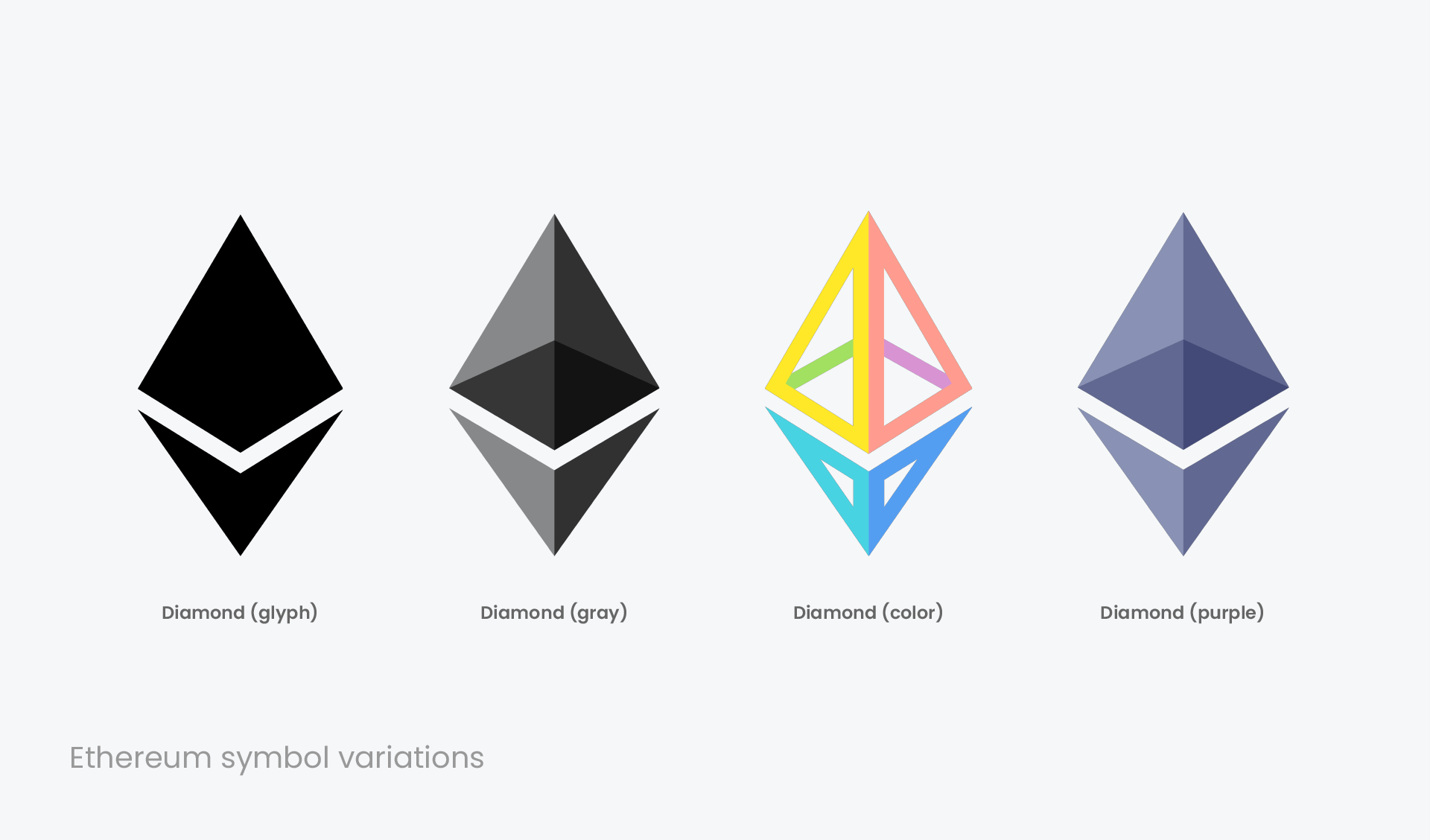
The Ethereum logo for transparent background comes in various color options of grey, purple, and a mixed version of pastel colors. The neutral and balanced grey is the color of intellect and compromise, negotiating all the distance between black and white. It is also the most commonly used color in the Ethereum logo.
3. Ripple Logo
What is Ripple?
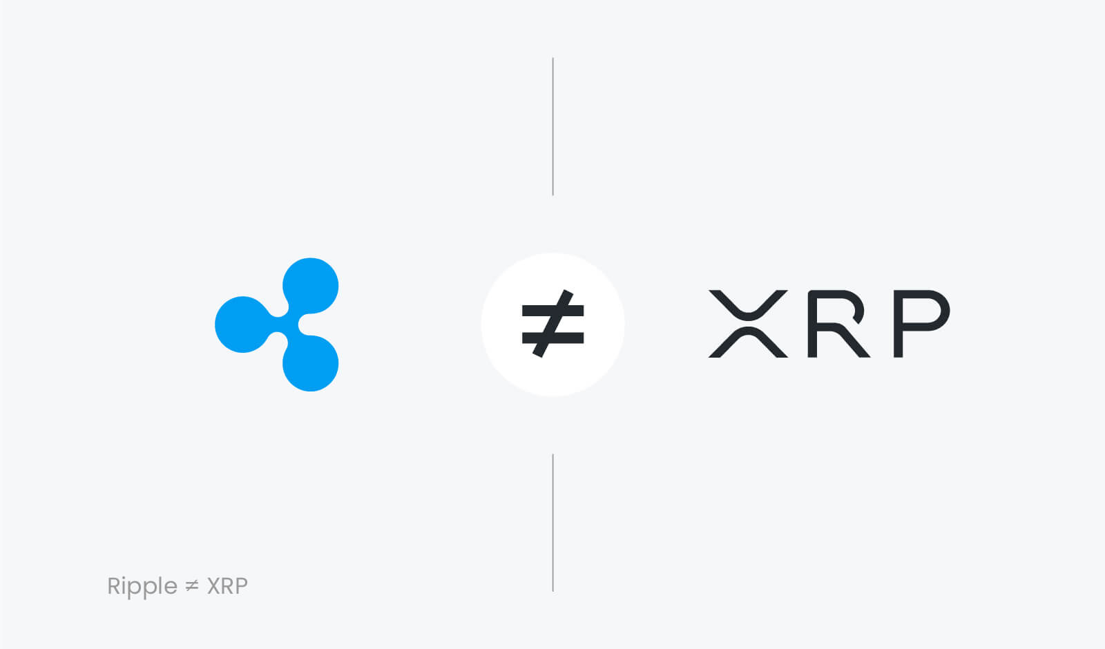
Ripple (XRP) is the fourth biggest cryptocurrency with an $11.1 billion market capitalization (the third actually, if we exclude the stablecoin Tether). But although it is called under the same name, Ripple and XRP are not equivalent in terms of design.
XRP is the native coin of Ripple. Meanwhile, Ripple is the American technology company built to change the way of the global payments infrastructure. Founded back in 2012, Ripple aims to enable financial institutions to transfer funds globally in a faster and cheaper way by using blockchain technology.
Ir relies on XRP Ledger, the distributed database that stores information about all Ripple accounts. It allows much faster transactions (1.500 transactions per second) at much lower prices than traditional financial institutions. Currently, Ripple made a number of solid partnerships and is one of the most prominent players in the cross-border payment industry.
Ripple logo
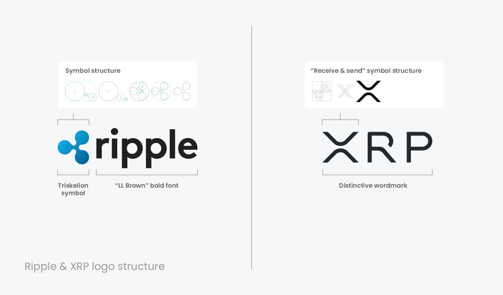
The Ripple logo is widely recognizable. And although it somehow reminds the legendary fidget spinner, the iconic symbol comes with a deeper meaning. It depicts Triskelion, the ancient Celtic symbol made of three joining spirals.
Its name comes from the Greek words “Tri” and “Skelos”, meaning the three legs. The triple spiral represents motion, which also signifies energy, movement, rotational symmetry and perpetuity.
Triskelion is said to be one of the oldest symbols of spirituality. It dates back to the Stone Age, as the oldest artifacts found come from approximately 3200 BC. Meanwhile, for Ripple, the same symbol is used to represent “the connected and distributed nature of a company’s technological solutions”. In terms of blockchain-based companies, the symbol might be interpreted as the one that represents decentralization and connectivity at the same time.
Evolution of Ripple logo
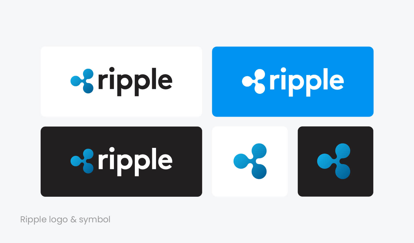
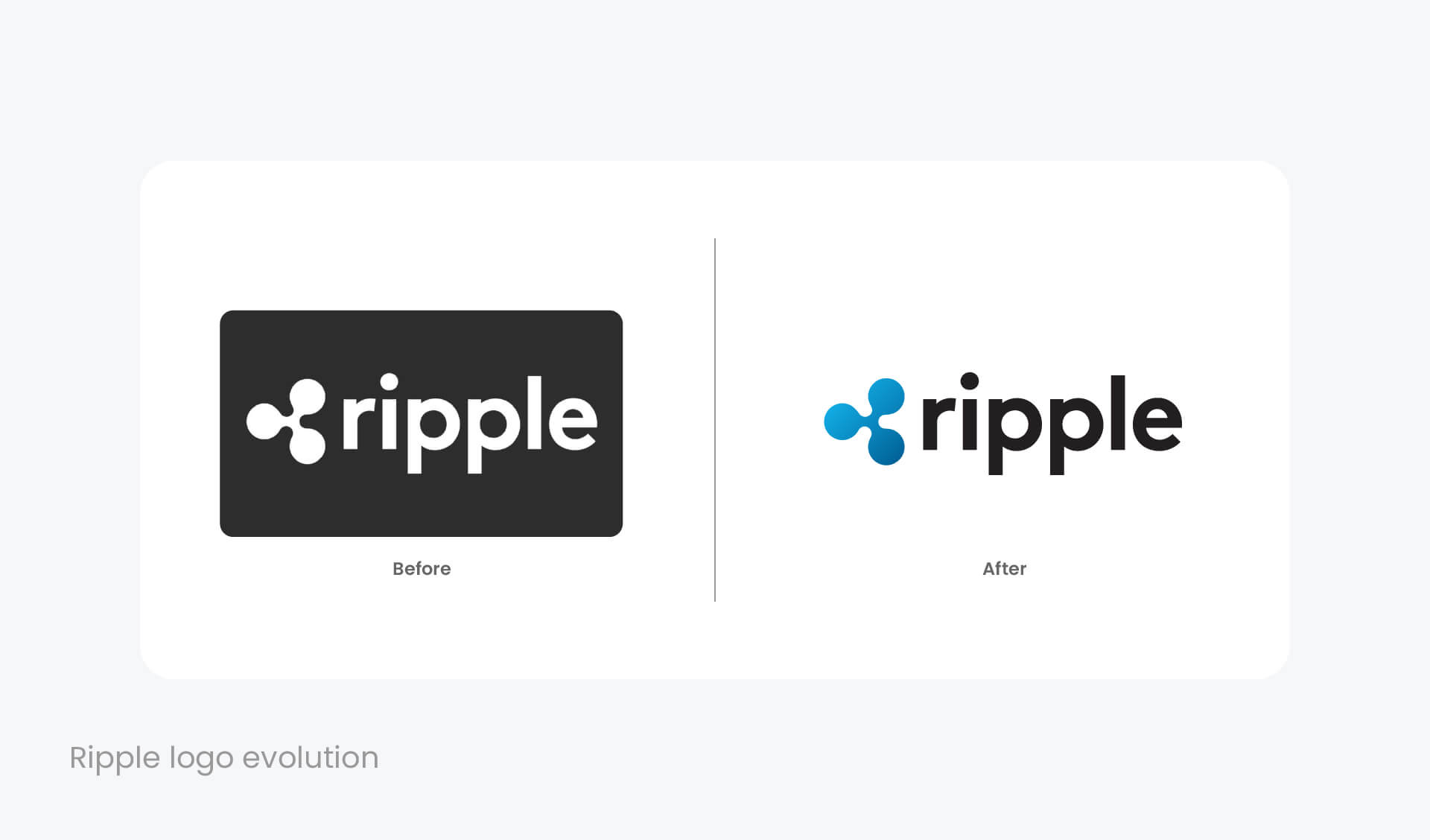
The Ripple logo has changed a little since it was first launched in 2013. However, the company redesigned it a few years later by adding more color and subtlety to the black and white logo of the time.
The current Ripple logo consists of two elements: triskelion icon and company name, written in simple typography. The gradient version of triskelion comes in various shades of blue color, representing depth, confidence, loyalty, and intelligence. And since blue as well represents serenity and reliability, it is one of the most popular choices among financial institutions and brands.
XRP logo
Meanwhile, Ripple’s native coin XRP comes with a completely different symbol. The modern triskelion is never used with the XRP cryptocurrency, which has its separate logo.
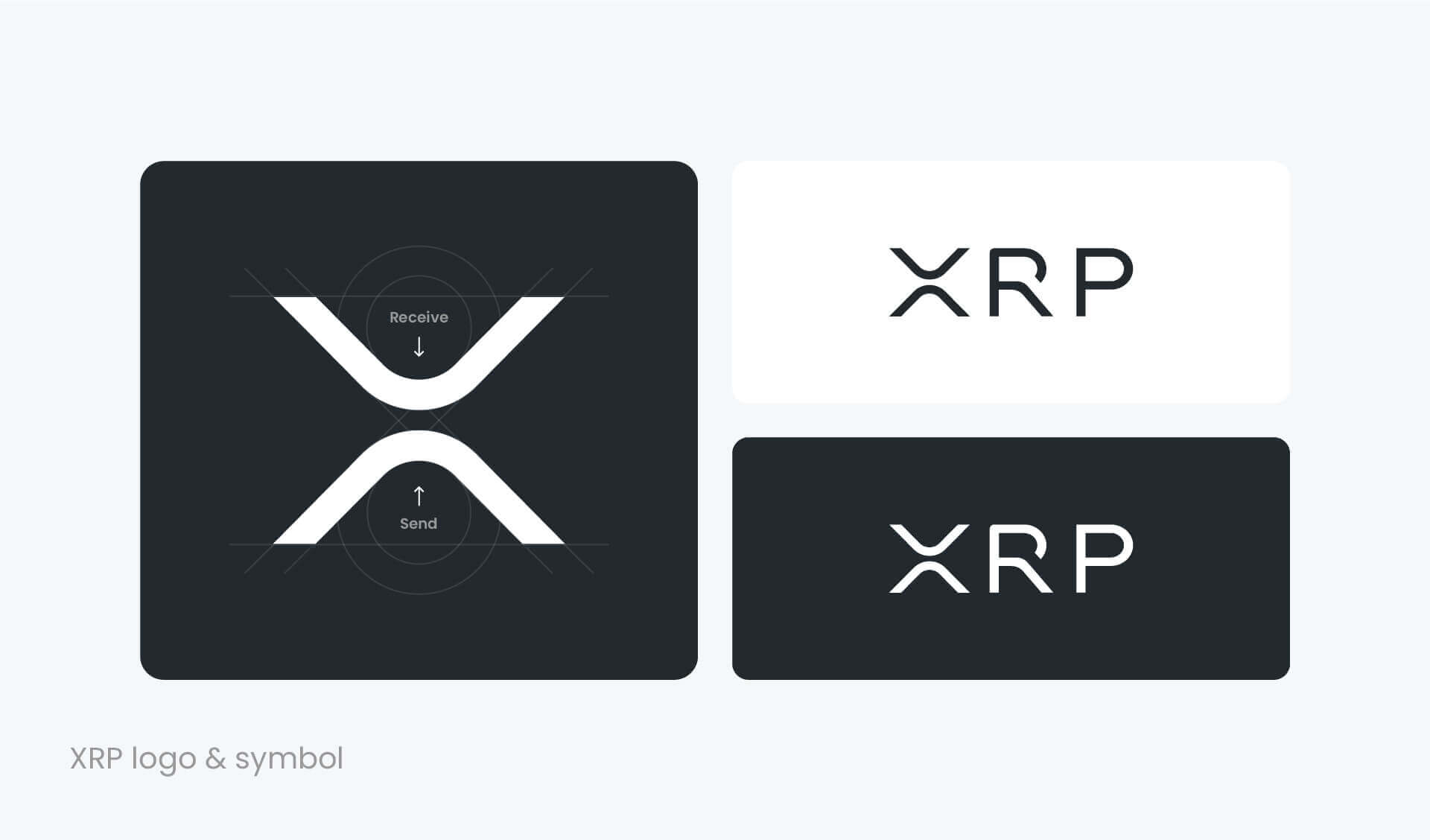
XRP logo consists of the stylized symbol of “X”, which partially represents the XRP role of moving funds across borders.
The symbol as well links to the meaning of mathematical multiplier, referring to blockchain technology and Proof of Stake (PoS) protocol processes where “entities are building on one another to create something bigger”. Furthermore, the XRP logo arrows symbolize the two sides of the transaction: sending and receiving.
As you can see, the world is filled with brands and logos. There are hundreds, thousands of them in front of us in reality and online. The visual noise is so loud that our eyes tend not to fix those that are dull and indistinguishable. We are looking for simple and memorable ones.
This is why a good logo plays an important role in helping to stand out and grab attention. And in this case, digital currencies are not the exception. The logotypes like Bitcoin, Ethereum, or Ripple logo help to identify and recognize the brands. And since logos are visual elements, they are easier to remember than words.
