- Price charts illustrate price changes over a certain time.
- Charts help identify the trends and best positions to enter/exit the market.
- Reading crypto charts include:
- Identifying trend
- Understanding chart patterns
- Following Moving Averages (MA)
To start trading cryptocurrencies, you first need to know how the price moves. This is easy to do as you may always see both current and historic price changes. Reading them, however, requires deeper knowledge.
Cryptocurrency charts visualize how the asset’s price has changed over a certain timeframe. In technical analysis, they are one of the main tools to predict the trend and future price movements. Learn useful tips on how to read cryptocurrency charts in the DailyCoin beginner’s guide.
What are the crypto charts?
Cryptocurrency charts are the cryptocurrency price patterns that help to foresee digital assets’ future direction. They also signal the upcoming bull or bear market. For those who know how to read crypto charts, they can help to choose the right time to open or close the trading position.
For many traders who trade on the basis of technical analysis, these price charts act as an important tool for understanding patterns and predicting trends.
How to read cryptocurrency charts?
1. Follow the trend
The trend is a general direction in which the asset price is moving. It allows understanding the tendency of how the price is going to evolve. Thus identifying trends is critical in order to make the right decision.
Sponsored
Trading along with a trend is the best option for the inexperienced traders. There even comes a quote “trend is a friend”. The cryptocurrency markets are volatile, and the price fluctuations might be the sharp ones. Attempting to predict them in advance can be tricky business. Thus having a broader view and knowing a general direction could help you a lot.
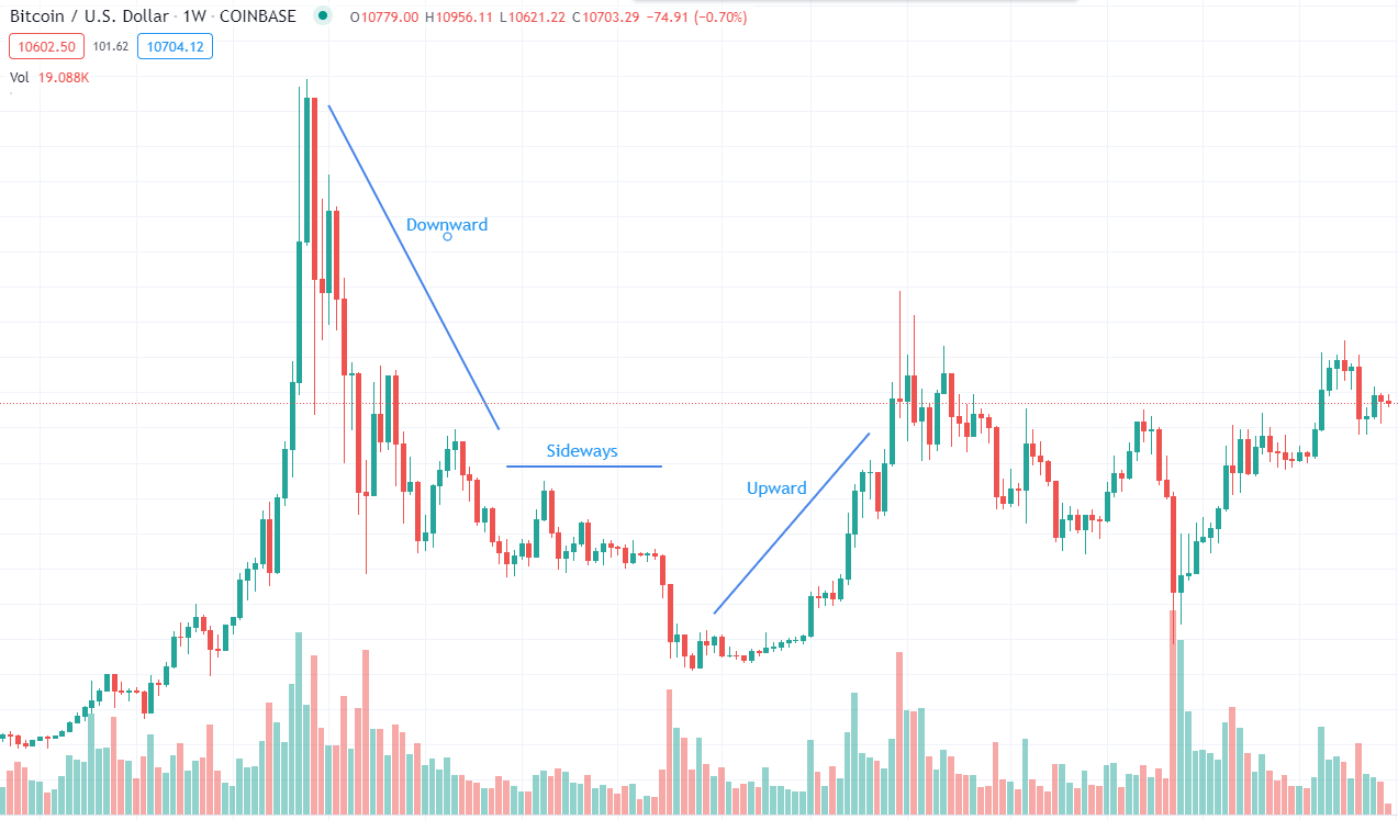
According to the directions, trends can be classified to:
- Upward (bullish) trend. The asset’s price rises constantly, making higher highs and higher lows.
- Downward (bearish) trend. The price falls making lower lows and lower highs.
- Sideways (horizontal) trend. The price travels between strong support and resistance levels.
Timeframe
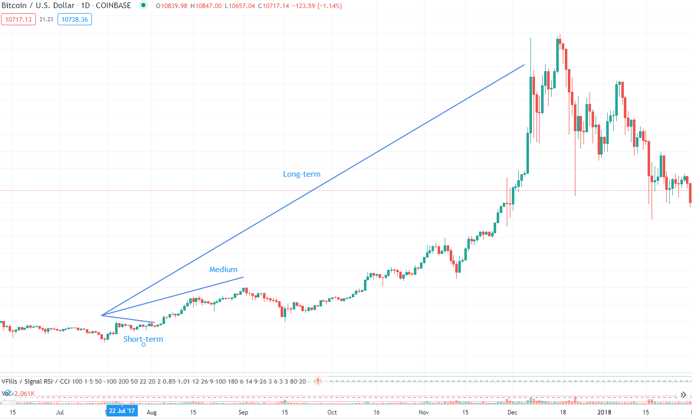
A timeframe plays a critical role in determining trends. The prices of digital assets are volatile. Furthermore, different price trends may occur at the same time. Thus it is important to define a precise time frame on which you are going to measure the price changes.
Sponsored
According to the time factor, we can classify trends into:
- Long-term trend. Usually last for 3 to 5 years, depending on the strength.
- Medium trend. Lasts from 1 week to several months.
- Short-term trend. Mostly it is from 1 hour to 1 week.
Volume
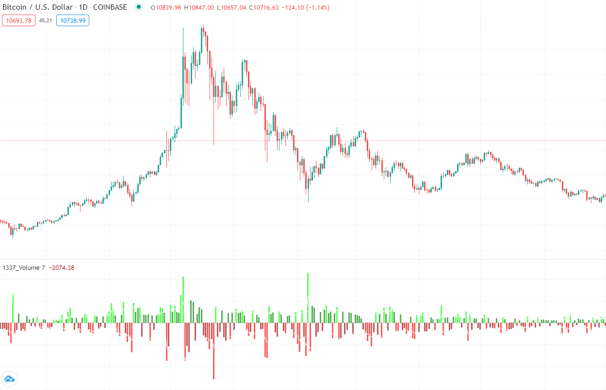
A volume is an important tool in confirming trends. It illustrates the amount of enthusiasm, that is strong enough to drive the prices higher. The larger trading volumes mean the stronger signal of market changes.
The uptrend markets usually see an increase in trading volume. Respectively, when the price falls, the volume declines. In addition, the fading volume when the price is still growing warns of the upcoming reversal.
2. Know the price charts
a. The types of charts
There are several types of digital asset price charts. However, the most popular and most widely used are:
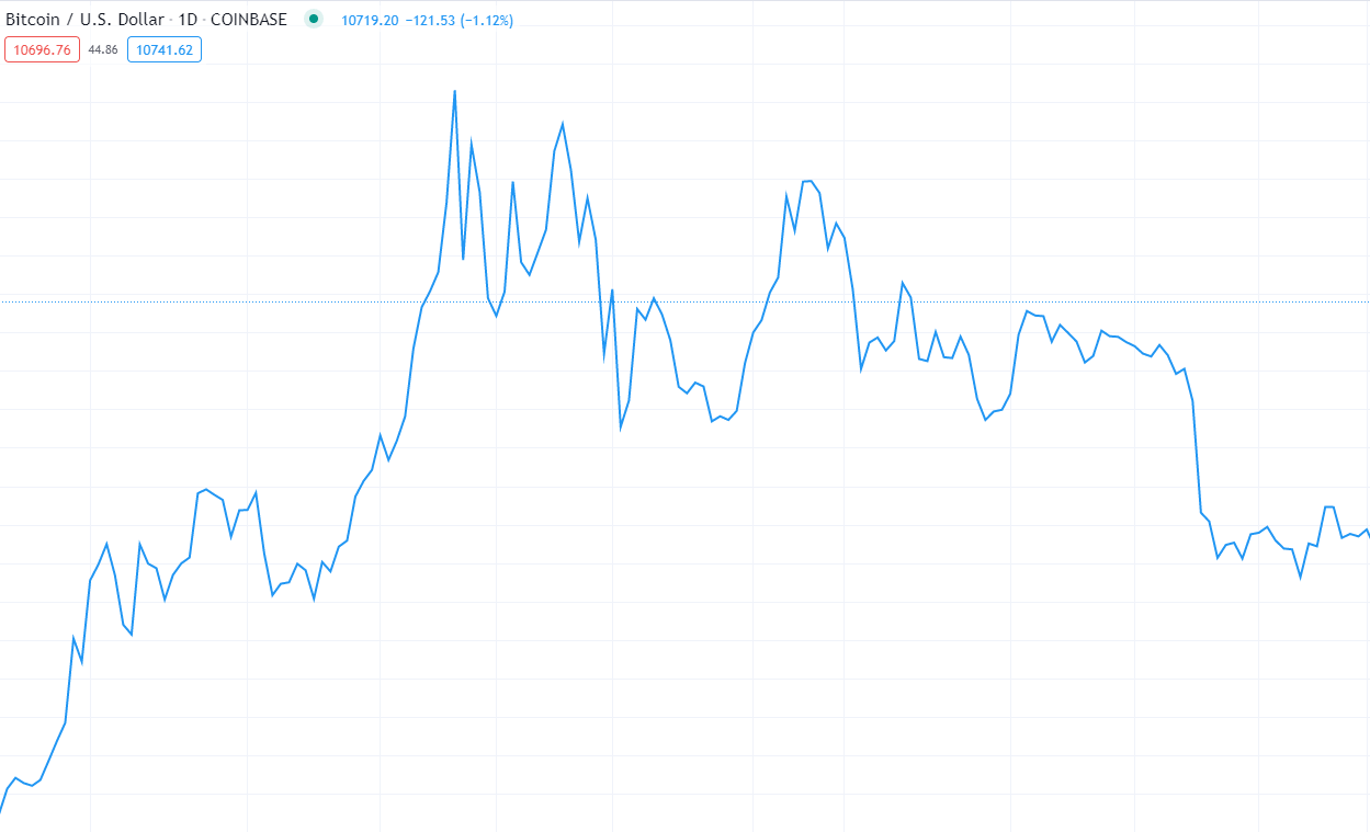
- Line charts. The basic chart, where crypto-asset price changes are conveyed by using a single line and show the closing or opening price during the specific time frame.
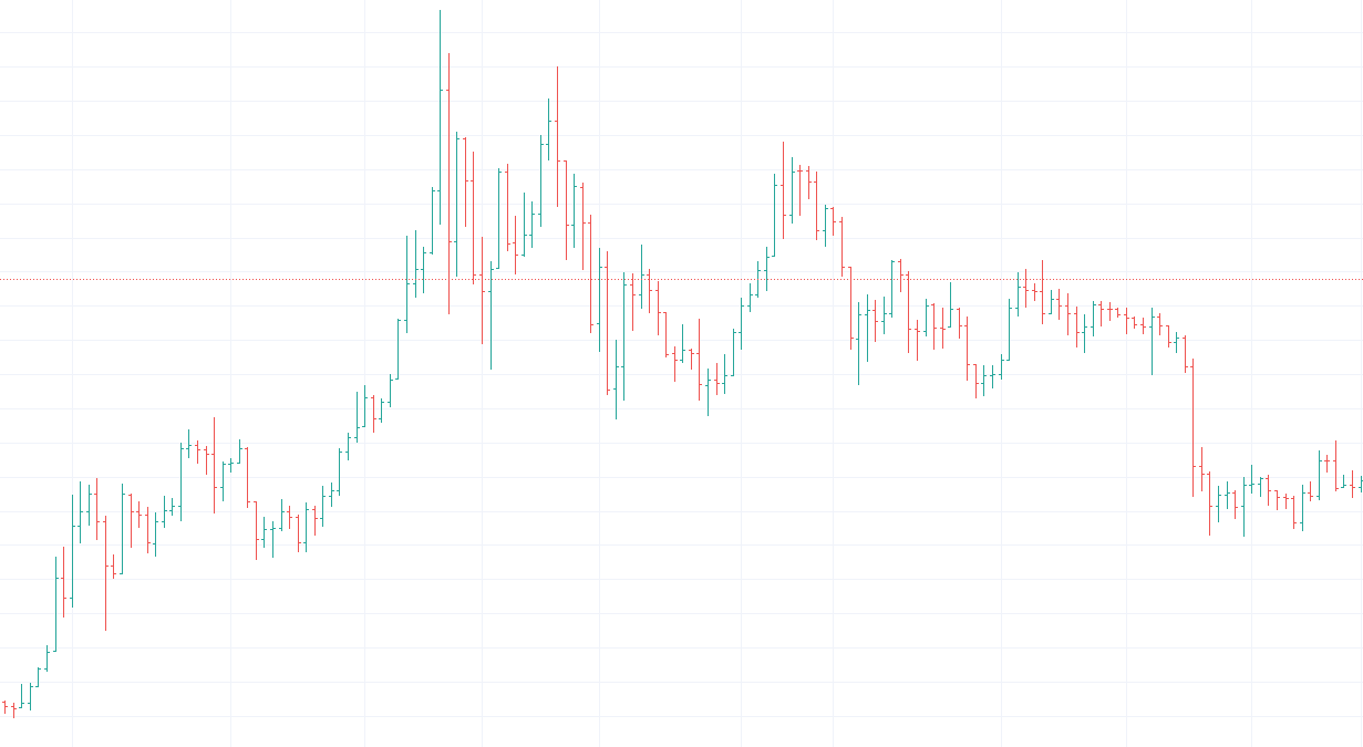
- Bar charts. A more detailed chart, that shows the opening and closing price as well as the highs and lows of the bar, which represents a specific time frame.
- Candlestick charts. Similar to bar charts, but have a body and are better visible.
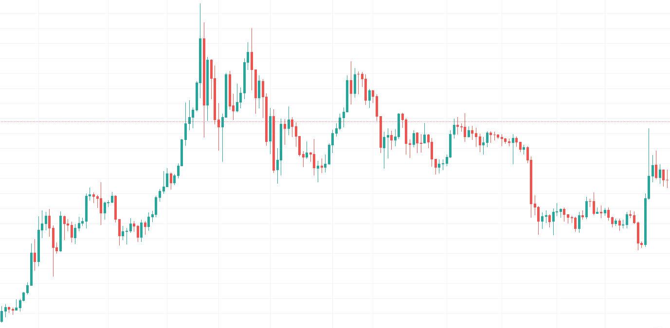
While the candlestick pattern is most widely used among digital asset traders, DailyCoin will introduce the most common trading chart patterns to a better knowledge of how to read Bitcoin charts and identify trading opportunities.
Candlestick: What does it say?
Candlestick (or Japanese candlestick) charts are one of the most visual cryptocurrency price charts. These charts are easy-to-read.
First of all, a single candlestick represents a certain period of time (1H, 1W, 1M, 1Y) on which you are trading or analyzing the historic price changes. The candles come in two colors: green and red. Each of them indicates who is controlling the market: the bulls (green candle) or the bears (red candle).
Secondly, the candlesticks are very informative. Each candle reveals four pieces of information at once. The candle’s body shows the asset’s opening and closing price. The green candle means that the closing price is higher than the opening. The red one indicates the price drop when the closing price is lower when openings.
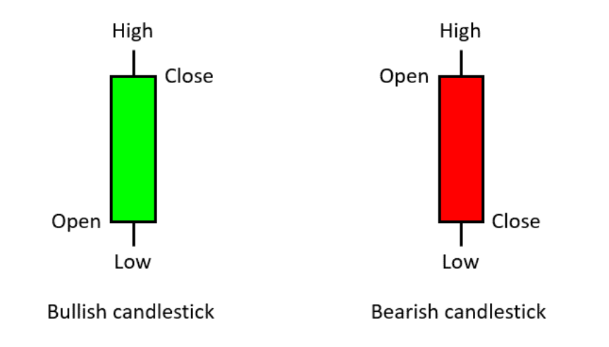
Finally, the “wicks” (sometimes called shadows) attached to the candle’s body indicate the highest and lowest prices within a certain time period. The length of the wick provides us with valuable trading information. The short wick means that trading sessions happened around the opening and closing price levels. Meanwhile, long wick signals higher volatility in prices.
Candlesticks are a great tool to predict a trend. There are various types of candlestick patterns for that. However, a good trader should not rely solely on them. A good trader uses candlesticks together with the other technical analysis tools to confirm a trend and enter the market.
b. The patterns of charts
One of the most important skills in successful trading is knowing how to read the cryptocurrency price chart patterns. There are 3 main types of these patterns:
- Continuation pattern. Shows the tendency to continue the current price trend.
- Reversal pattern. Signals that the current price direction is going to reverse.
- Neutral pattern. Price formations where the further direction remains unknown.
Continuation patterns
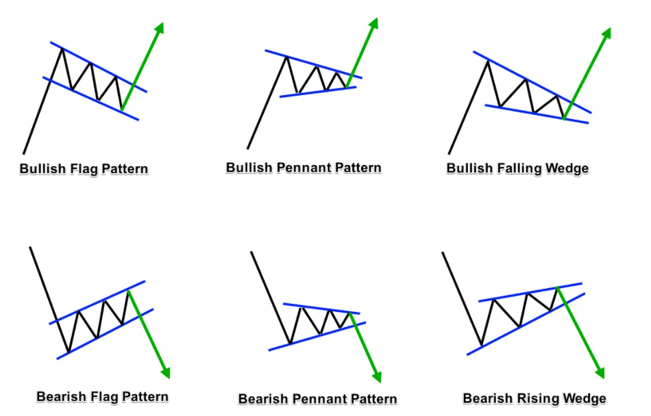
Continuation patterns act as a pause after the trend and mark the period of hesitancy. They form when the market expects the continuation of an ongoing price direction.
It is said that the stronger the trend is before the continuation pattern, the stronger breakout will be. Unfortunately, not all continuation patterns result in a continuation of the trend. Many of them result in reversals.
The most popular continuation chart patterns are:
- Flags. Occur when the asset price moves in a strong trend and suddenly stops. Allows entering the market in the middle of the trend.
- Pennants. Come after a sharp rise, indicate the pause in a strong uptrend.
- Wedges. Indicate continuation or reversal pattern. Depends on where it sits on a price chart.
Reversal patterns
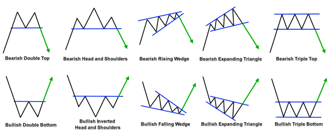
Reversal patterns mark a point of transition when the trend changes and the rising market turns into the falling one. The most popular reversal chart patterns are:
- Double tops and bottoms. Signal a reversal from an uptrend to a downtrend. Two peaks/bottoms form at nearly the same level, stopped by the strong resistance.
- Head and Shoulders. Form after strong trends. Prices rally further and form the highest (head) and lower (shoulders) peaks, then break.
- Wedges. May come as a continuation or reversal pattern, depending on the previous trend. Rising Wedge has bearish potential, Falling Wedge – bullish despite the trend.
- Expanding triangles. A rare but tricky pattern occurs in highly volatile markets. Forms when the prices fluctuate to higher highs and lower lows continuously.
- Triple tops and bottoms. Similar to the double tops and bottoms. Three peaks/bottoms create a resistance level, that prices are unable to break and sooner or later reverse.
Reversal patterns mark a point of transition when the trend changes and the rising market turns into the falling one. The most popular reversal chart patterns are:
Neutral patterns
Neutral patterns signal that the direction of the upcoming breakout is unknown. The price may turn both up and down. Thus it is better to be careful when trading neutral chart patterns. Wait for the price breakout and hold for the trend confirmation before opening/closing the position.
The most widely used neutral patterns are these:
- Ascending Triangle. Flat highs, higher lows. Indicates the weakening resistance level, when the price has the potential to break and go up.
- Descending Triangle. Flat lows, lower highs. Opposite to the ascending triangle. If the support level weakens, it has the potential to break down.
- Symmetrical Triangle. This occurs when price trades between support and resistance levels. Neither bulls nor bears take control.
- Symmetrical Expanding Triangle. Rare pattern, that does not relate with a trend. Price tests higher highs and lower lows. Both bulls and bears have strength, but not enough to continue the breakthrough.

3. Use Moving Averages (MA)
Moving averages (MA) are one of the core technical analysis indicators. In general, they show the average price of the asset over a certain time period. MA helps to identify the direction of the current trend.
Moving averages come in different versions and here we learn about the most common ones:
- Simple Moving Average (SMA)
- Exponential Moving average (EMA)
- Moving Average Convergence Divergence (MACD)
Simple Moving Average (SMA)
SMA is the most common and most simple type of moving average. It is calculated by summing up the closing prices of the specified timeframe and dividing them the number of prices. You get the average price of the specific time frame then.
Here’s an example: You have to calculate the SMA of asset x for the last 5 trading days (SMA5). Let’s say assets price for these days was: $20, $22, $26, $25 and $21.
First, you sum up all the prices: $20 + $22 + $26 + $25 + $21 = $114. Then you take a total of $114 and divide it by the total number of days(5): $114 : 5 = $22.8. Your average price of 5 days is $22.8.
Like any other moving average, the SMA moves and changes. The closing prices of the asset constantly change. So when you calculate the SMA for 10 or 20 days, you repeat the process by summing up the closing prices of the latest 10 or 20 days.
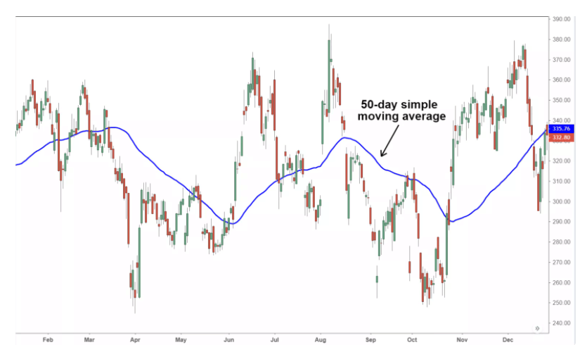
To read crypto charts you may also use two different SMAs at a time. One for a shorter time period, another for a longer time period (let’s say SMA50 and SMA 200). However, reading SMA is simple:
Signals uptrend
- SMA goes up
- Green candlestick crosses SMA
- Short-term SMA crosses ABOVE long-term SMA
Signals downtrend
- SMA goes down
- Red candlestick crosses SMA
- Short-term SMA crosses BELOW long-term SMA
Exponential Moving Average (EMA)
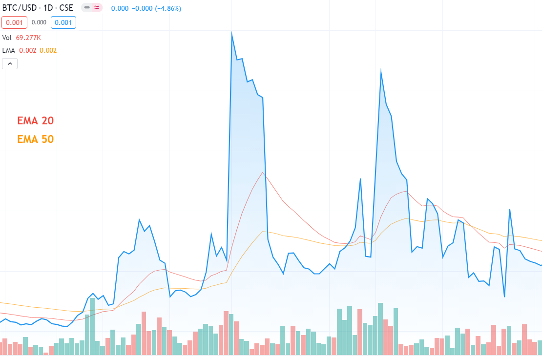
Like SMA, the exponential moving average (EMA) also tracks the asset’s price over a chosen time period. However, EMA focuses on newer prices. This means that the exponential moving average reacts more quickly to price changes.
EMA is more sensitive to price movement than SMA. It is used to detect price trends, although it gives more weighted price data. It is calculated by adding the latest price to the previous EMA calculation result.
Reading EMAs is the same as SMA’s. When a short-term EMA crosses above the long-term EMAs, the trend goes up. When the short-term EMA crosses below short-term EMA, the market turns downtrend.
Moving Average Convergence Divergence (MACD)
Moving Average Convergence Divergence (MACD) is a widely used indicator that follows the trend and confirms the momentum of its change. MACD consists of moving averages and is calculated by subtracting the longer EMA from the shorter EMA.
The result is called the MACD line and is usually calculated by subtracting 26 days EMA from 12 days EMA. MACD always comes with the Signal line, which usually is a 9 day EMA, plotted on the MACD line.
Usually, MACD comes with a histogram, that illustrates the distance between the MACD and the signal line. When the MACD is above the signal line, the histogram will appear above the baseline and vice versa. When MACD is below the signal line, the histogram dives below the baseline.
MACD line and Signal line crossovers may also act as trend confirmation. Furthermore, they help to indicate the right enter/exit positions. It is not difficult to read them if you follow the basic rules below.
Signals uptrend
- MACD line moves in trend direction.
- MACD line crosses ABOVE the signal line.
- MACD is below baseline in the histogram.
Signals downtrend
- MACD line crosses BELOW the signal line
- MACD is above baseline in the histogram.

4. Try Crypto Fear & Greed Index
Good psychological skills are an advantage in trading. Sentiments drive the markets more often than you think. Even experienced traders follow their emotions and make irrational decisions.
To navigate better in volatile cryptocurrency markets, Crypto Fear & Greed Index might be very helpful. It shows what emotion is driving the market at a specific time.
The index is calculated by gathering statistical data from a variety of sources, including the historical data of the asset’s volume and volatility, mentions on social media, search engines, and other sources. You may read more about Crypto Fear & Greed Index in this DailyCoin article.
Conclusion
As you may see, reading cryptocurrency charts means analyzing the previous asset price movements. The historical price data has a lot to say. Furthermore, it indicates future price actions.
Besides the technical analysis, knowledge of fundamentals is equally important. Following what happens in the crypto industry may help you to have a broader view of processes that also affect the prices of digital assets.
Meanwhile, in this beginner’s guide, we introduce you to the most common technical analysis tools. There are still a lot more of them. We recommend deepening your knowledge in each of them. Using these tools may help to create your own style on how to read cryptocurrency charts and trade more successfully.
