
In the battle of between golden cross and death cross, it’s hard to know which chart pattern shocks crypto YouTubers more. Both cross signals inspire a series of compelling mouth-open-thumbnails just begging to be clicked.

Jokes aside, these cross signals are one way of confirming a trend reversal in action. Like all technical analysis tools, these patterns aren’t only used in cryptocurrency, they’re also used in FOREX and the stock market.
Sponsored
Despite what their names might suggest, golden crosses and death crosses aren’t as clear-cut as they appear. A golden cross doesn’t guarantee the Bitcoin (BTC) bull run is back and it’s time to go all in. Likewise, a death cross isn’t necessarily a bearish signal.
In this article, we’ll review the basics of moving averages and break down the differences between a golden cross and a death cross.
Technical Analysis Basics – What Are Moving Averages?
A moving average is a technical indicator that measures the average price of an asset over a period of time. Traders often use moving averages to calculate support and resistance levels based on previous asset prices.
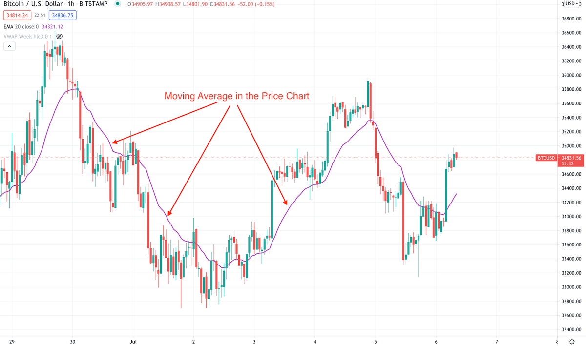
It’s important to note that moving averages are lagging indicators, meaning they confirm trends that have already happened. They are not a great indicator for predicting future price movement.
Simple Moving Average (SMA)
The most common moving average is a simple moving average, or SMA. An SMA is calculated by adding the closing price of an asset during a chosen period and dividing it by the number of periods in that timeframe.
For example, imagine the daily BTC chart closed at $25,000, $26,000, and $30,000 over the last three days. At the end of this period, the BTC 3-day SMA would be (25k+26k+30k)÷3 = $27,000. In this example, BTC would be in an uptrend.
On a shorter timeframe, like a one-hour price chart, traders could use $27,000 as either a resistance or support level, depending on current price action. As you can probably guess, longer-term moving averages determine long-term price trends, while short-term averages confirm recent trends.
Exponential Moving Average (EMA)
An exponential moving average, or EMA, adds weighted variables to the SMA equation. They are more responsive to recent price movements and help traders determine the current price trend rather than confirming a past trend.
Moving Average Convergence Divergence (MACD)
A moving average convergence/divergence, or MACD, is a technical indicator highlighting the relationship and fluctuations between two separate EMAs of an asset’s price. Traders use the MACD to identify a trend reversal and gauge the potential strength of a new trend. To find the MACD line in a one-day timeframe, traders subtract the 26-day EMA from the 12-day EMA.
When the short-term moving average is above the long-term moving average, the MACD is positive. This is generally considered a bullish signal, suggesting a continuing uptrend.
What Is a Golden Cross?
When the 50-day moving average crosses above the 200-day moving average, this is called a Golden Cross. A Golden Cross indicates that the asset is in a confirmed uptrend. Essentially, the average price of the asset over the previous 50 days is now higher than the average price over the last 200 days.
How to Spot a Golden Cross
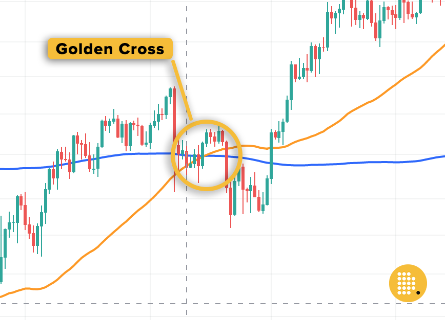
In the example above, we can clearly see the 50-day MA (orange line) crossover the 200-day MA. The shorter moving average has crossed, the longer moving average, suggesting a trend reversal has taken place over the last 200 days. To some traders, this might be enough to convince them that a perilous bear market is over.
Are Golden Crosses a Reliable Indicator?
Like all technical analyses, a golden cross should be taken with a grain of salt. Golden crosses are a chart pattern derived using lagging indicators, so they should only really be used to confirm trends that have already happened. They shouldn’t be used as evidence to tell your friends and family that the bull market is minutes away.
A golden cross is often followed by a brief price dump as traders take profits on the last 50 days of price appreciation and euphoric buyers pour high trading volume into the market.
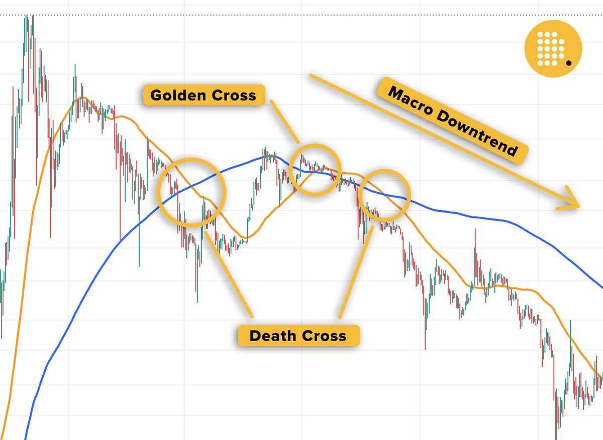
In the image above, we see a particularly turbulent BTC trading period in 2014. A sharp price drop printed a death cross in the BTC chart. A short relief rally reversed the trend. The breakout convinced buyers they were back in a bullish market. A hopeful golden cross appeared in the charts, before being snuffled out by another death cross as a macro downtrend continued.
What Is a Death Cross?
A death cross is the exact opposite of a golden cross. A death cross occurs when the 50-day average crosses below the 200-day average. It confirms an existing downtrend, as asset price over the last 50 days is lower when compared to the last 200 days.
How to Spot a Death Cross
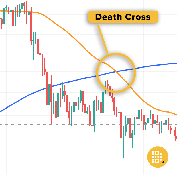
It should come as no surprise that when our orange line, the 50-day moving average, slips beneath our blue line it paints a death cross on our chart like a band of pirates. It confirms that the last 50 days in the markets have been decidedly brutal.
But don’t lose all hope just yet. In the same way a golden cross doesn’t promise explosive gains in our future, a death cross doesn’t always forebode doom and gloom.
Are Death Crosses a Reliable Indicator?
A death cross is a reliable indicator in the sense that it confirms a trend that has already happened. However, it’s worth remembering that death crosses rely on lagging indicators and aren’t a great method for predicting future price movement.
For example, the last Bitcoin death cross in early 2023 sent waves of fear throughout the crypto market. Yet a few weeks later, BTC’s price bounced and began pushing to new YTD highs.
How to Use Cross Signals in a Trading Strategy
If you hadn’t guessed already, golden crosses and death crosses should not be the backbone of any trading strategy. To say the crypto market is volatile is an understatement, so it should come as no surprise that sharp price moves mean that cross signals are expected.
That being said, golden crosses and death crosses are still useful indicators when used in conjunction with other tools in your technical analysis toolbox.
In most cases, golden crosses and death crosses are used as trend-reversal signals. For example, if a golden cross appears after a long-term macro downtrend it would generally be considered a bullish signal, encouraging buyers to enter a trade.
On the Flipside
- In general, technical analysis cannot prepare any trader for black swan events like the Luna crash or the FTX debacle. Unfortunately, these catastrophic events occur without warning, meaning even the best TA wizards can be blindsided.
Why You Should Care
Golden crosses and death crosses are often sensationalized to prompt either complete euphoria or overwhelming fear, uncertainty, and doubt in the market. Learning about cross signals and what they represent can help you make informed decisions in the cryptocurrency market, instead of reacting emotionally to headlines.
FAQs
A golden cross means the 50-day moving average has crossed over the 200-day average. This generally confirms that the asset has been in an uptrend over the last 50 days.
Both simple moving averages (SMA) and exponential moving averages (EMA) can signal a golden cross in a price chart.
A golden cross is widely considered a bullish sign that the market is in an uptrend. However, it should not be trusted 100% of the time because it relies on lagging indicators.
A Bitcoin death cross is a simple chart pattern that occurs when the 50-day MA crosses below the 200-day MA. It’s not an event that lasts for any particular duration.